Parallaxian Logo Reveal
Posted on
By Kodiak
It's finally here, the official logo for Parallaxian,
my next generation Commodore 64 game in development, presented in all its Photoshopped web-ready splendour:

The design brief I gave myself was this:
- The logo must be in high resolution and use no angles, slopes or curves that would imbue it with any blockiness.
- It must be evocative of the decade of the Commodore 64's primacy, the 1980s, without falling prey to any aspect of the worst excesses of misguided C64 logo design in said era.
- It should also be distinctive and unique, avoiding the "sameness" of other C64 game logos as much as reasonably possible.
- It should, above all, convey the ostentatious ambitions of the game.
So no big challenge, right?
Well... In the end, I said sod it and let's just see what can be done with Def Leppard's
and
Ratt's angular logos.
A few days of tinkering on the char editor and I had the basic idea drilled down; it would take another few weeks of (on and off) panel-beating to get it to where it is
now; the image below shows some of the steps along the way.
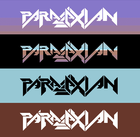
The web version - which incidentally forms the basis of the planned packaging and promotional materials - was ported directly from the C64 char original and worked up with photo-editing
software.
Anyway, I hope you like it even half as much as I do!
____
If you value my work and want to support me, a small donation via PayPal would be nice (and thanks if you do!)